Last week I wrote about design swatches, and I mentioned they’re one of the two most important visual elements of a pattern proposal. This week I’ll explore the other half of that visual dual – design sketches.
A design sketch is your primary tool to communicate the overall shape and style of your design. While the swatch focusses on texture, yarn choice, and a close-up view of design elements, the sketch shows the overall shape, size, and style of the design while conveying how design elements work together. Let’s break down what the sketch needs to show, and talk a little about each element.
- This is the overall look and feel of your piece. What do you want the knitter to feel when they first see your design? Are you going for sleek and elegant? Rustic and earthy? Edgy and daring? Some of this will come through in the yarn choice and stitchwork choices, to be sure, but much of this aspect of the design is communicated with the overall shape and the choice of how design elements will come together. For example, a rustic earthy shawl might be on the larger side, with a generous width to length ratio, and simple geometries that let the texture of stitchwork and yarn choice take centre stage. A sleek and elegant scarf might be long and narrow, with design elements that emphasize fluid lines and unique but refined details. When you sit down to sketch the overall shape and combination of design elements that will make up your patterns, start by picturing the feeling you want to communicate. Before you decide your sketch is complete, step make to make sure that feeling comes across clearly. Don’t be afraid to iterate until you’re sure it does.
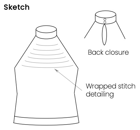
- It can be a little tricky to communicate a 3-dimensional pattern shape in a 2-dimensional sketch. I usually address this in a couple of ways. For designs where the overall shape is really about how the piece will look when worn, I’ll often include two sketches – one showing the item laid flat, and one showing it as worn. This gives a chance to indicate the relative dimensions and design elements in the flat sketch, and to communicate the look and feel of the shape in the as-worn. The as-worn sketch doesn’t have to be overly complicated; it doesn’t even have to show a figure if this isn’t your strong suit. Think about how you envision the piece looking when it’s worn, and sketch your design showing that shape. For example, a rectangular wrap might showcase linear detailing sitting at a beautiful angle when worn draped forward over the shoulder. The first sketch example below shows this approach. For designs where a particular detail showcases a unique shape, I’ll generally include an inset sketch showing that part of the design in more detail. This approach also works well when you want to show the design from more than one angle (for example, a top that has an interesting shape to the back of the collar). The second example below shows this approach. Whichever sketch approach you choose, the goal is to help the reader to picture your design in a shape that is most beautiful/unique/true to your vision.
- Design details. It can be tempting to try to put all of your design details into the sketch. If you have a lot of stitchwork changes or structural elements to show, this can become cluttered, and can detract from the overall impression of your sketch. Think about how the details (texture, stitchwork choices, colour changes) inform the overall impression you want to make with your design. It’s this impression you want to communicate, more so than the details themselves. Consider simplifying sketch techniques that communicate aspects of your design. For example, I’ll often communicate texture changes with hatching, which makes a visual distinction, but tends to settle more into the background rather than competing with other aspects of the sketch. I’ll also often connote a textured segment or a series of linear details with a few simple lines. These don’t prescribe exactly how the stitchwork will look (remember the sketch will pair with the swatch to show stitchwork), but they tell the eye how the features of the design will flow and interact with one another. They get the point across, without creating a lot of clutter. The two sketch examples above include illustrations of using hatching and simple linear detailing to communicate texture.
I’ll leave you with one overarching piece of advice – when in doubt, think ‘simplicity.’ Focus on what’s most important about your design (your unique combination of style, shape, and design details), and make sure your final sketch communicates those most important elements. Remember, it’s more about a feeling than it is about specific lines on page.
One point I haven’t discussed today is tools for sketching, including hand sketching vs drawing with available digital shapes, for example in PowerPoint. This will definitely be on my radar for upcoming blog posts, so stay tuned!
If you’d like to see more examples of how these principles can be applied, you definitely want to learn more about my upcoming masterclass, Pattern Proposals that Impress. This course is jam-packed with examples and practical tips. Make sure you’re on my mailing list to get all the details about the course release!

