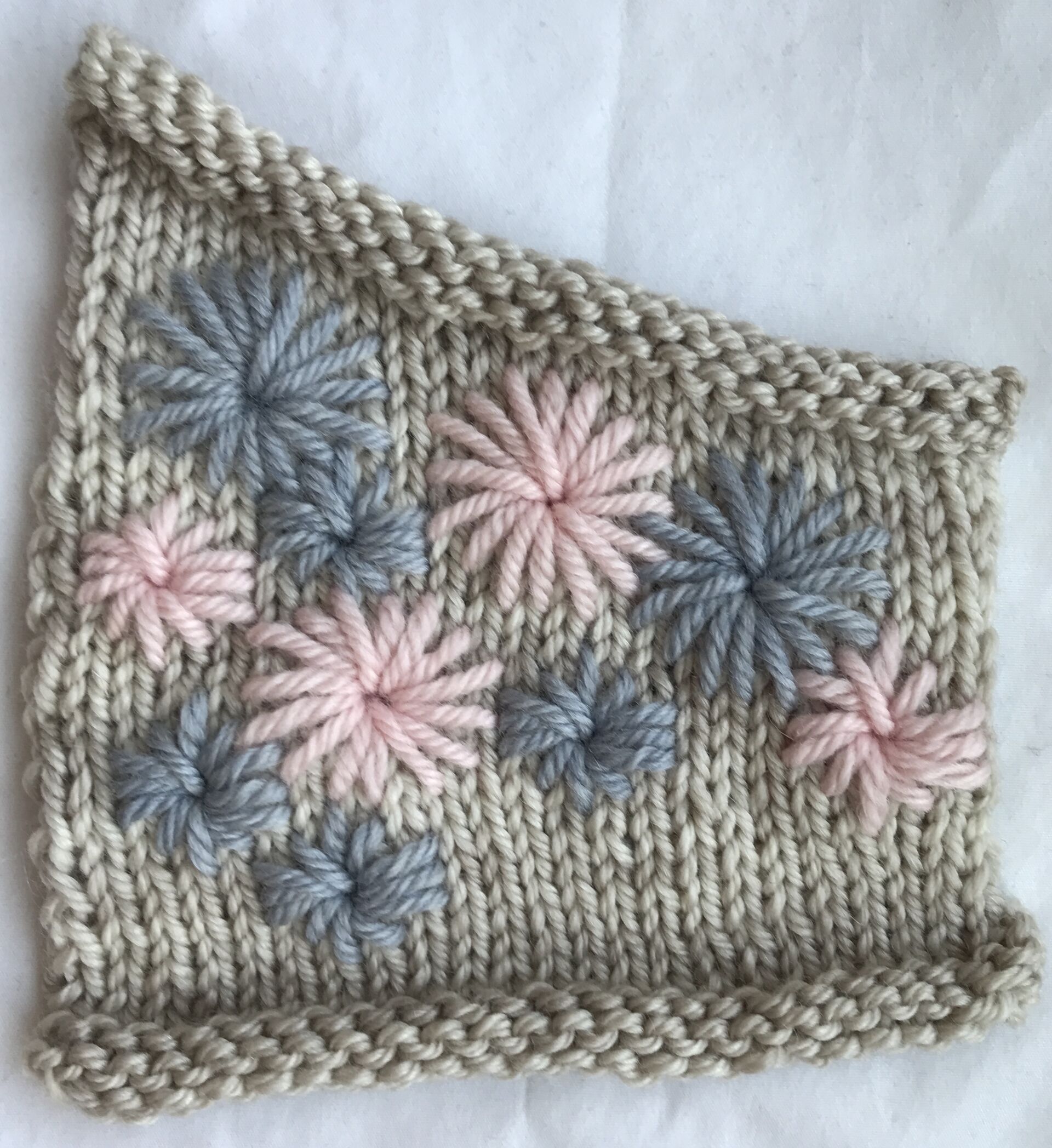
If you’re a designer or you’re thinking of giving design a try, design swatches are a critical (and fun!) tool in your repertoire of design communication skills. Learning how to create and photograph a great design swatch is one of the best ways to make a stand out first impression when your design proposals land in front of publishers and/or yarn suppliers.
You might be thinking, ‘I’ve made tones of swatches for my personal projects; I have this down.’ This might be true, and there’s certainly overlap between design swatches and those you work for your personal projects. They’re both used to assess gauge and to check how stitchwork patterns look on given yarn options. Design swatches, however, serve two other critical purposes – they communicate key elements of your design, and perhaps most importantly, they form a big part of your first impression. Let’s have a look at these two points.
- Communicating your design’s key elements. This first point connects to what to include in your swatch. You want to choose a set of stitchwork that captures the main features of your design, and communicates the design’s essence. It can be helpful when choosing what to include to think back to your inspiration for this design. What do you most want people to see and feel when they first look at your finished design? Which aspects of your design most communicate this look and feel? Examples could be a particular type or combination of stitchwork, how the choice of yarn works with the stitch texture, or a certain shape, colour, or style element. The swatch doesn’t have to include all parts of the design, and it doesn’t have to be entirely to scale compared to the design. It’s most important to communicate the look and feel of your design. This brings us to the next point – making a visual first impression
- Make an excellent first impression. Together with the sketch, your swatch forms the visual cornerstone of your pattern proposal. These two elements have the greatest impact on your first impression. For that reason, with a design swatch it’s important to actually fuss the details a little. When you lay out the swatch to block (or when you lay it out for a photo if it’s a design that doesn’t call for blocking), take time to make sure the stitchwork sits evenly, linear details form clean lines, eyelets sit open, etc. Make sure your photo is taken in good, even light, and that it shows the stitchwork clearly. Treat capturing a great image of your swatch like a professional photoshoot; don’t be afraid to take a few shots until you land on one that you feel really communicates the style and essence of your design.
I could spend all day chatting about design swatches and pattern proposals! In fact, I have a masterclass on pattern proposal writing (as part of my design coursework) that will be ready to launch in a few short weeks. Between now and then I’ll be talking through other aspects of pattern proposals, how they fit with the overall communication of design ideas, and tips for doing each aspect well.
I hope you’ve found today’s entry helpful, and I look forward to seeing your design swatches!
As always, make sure you’re on my mailing list to get the latest updates on course development, design tips, and pattern releases.
Happy knitting!

